Deel Blog & Resources
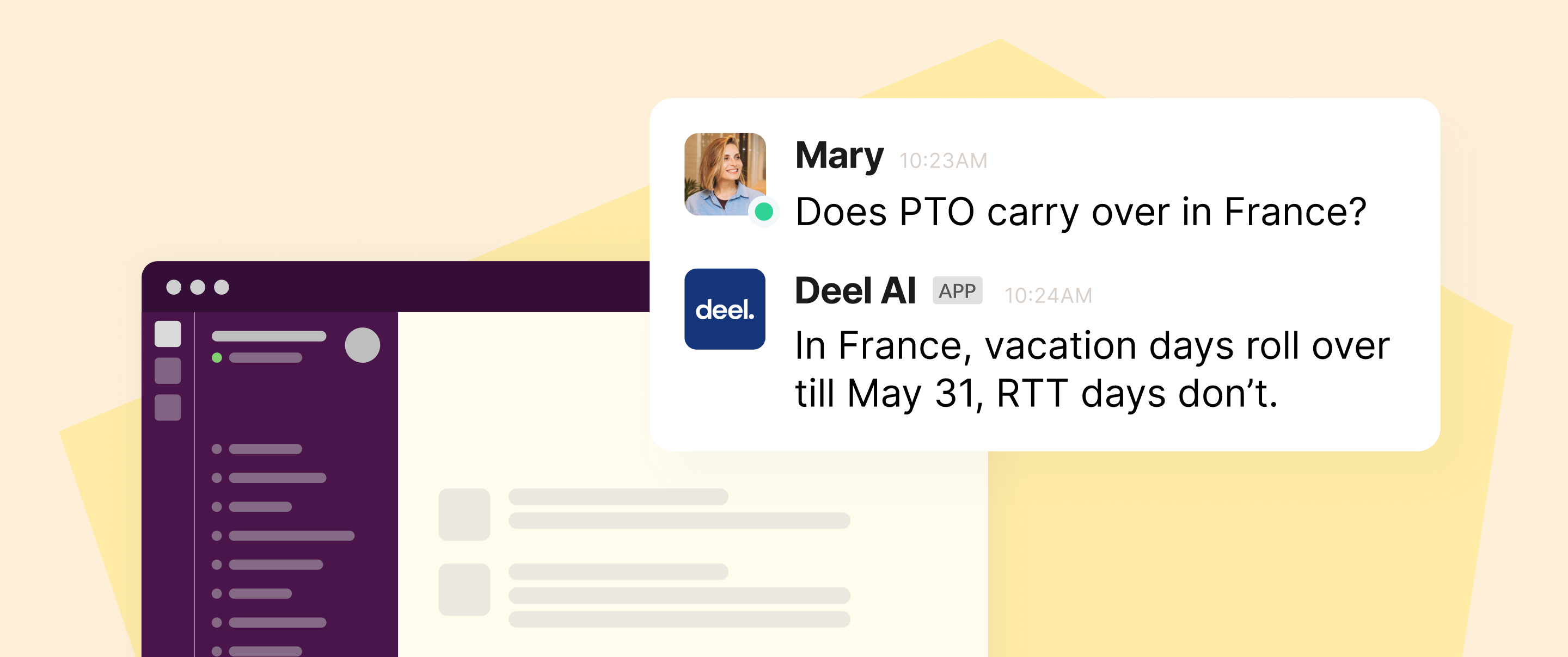
Deel AI’s Expertise, Now on Slack
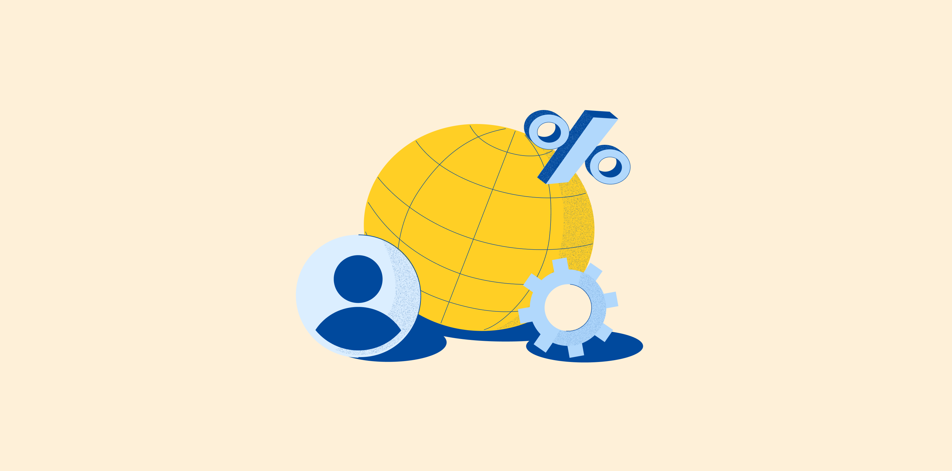
Deel AI for Slack brings our AI-powered work assistant onto Slack so you can get answers about global HR in seconds. Answers are just a Slack message away.
Read this story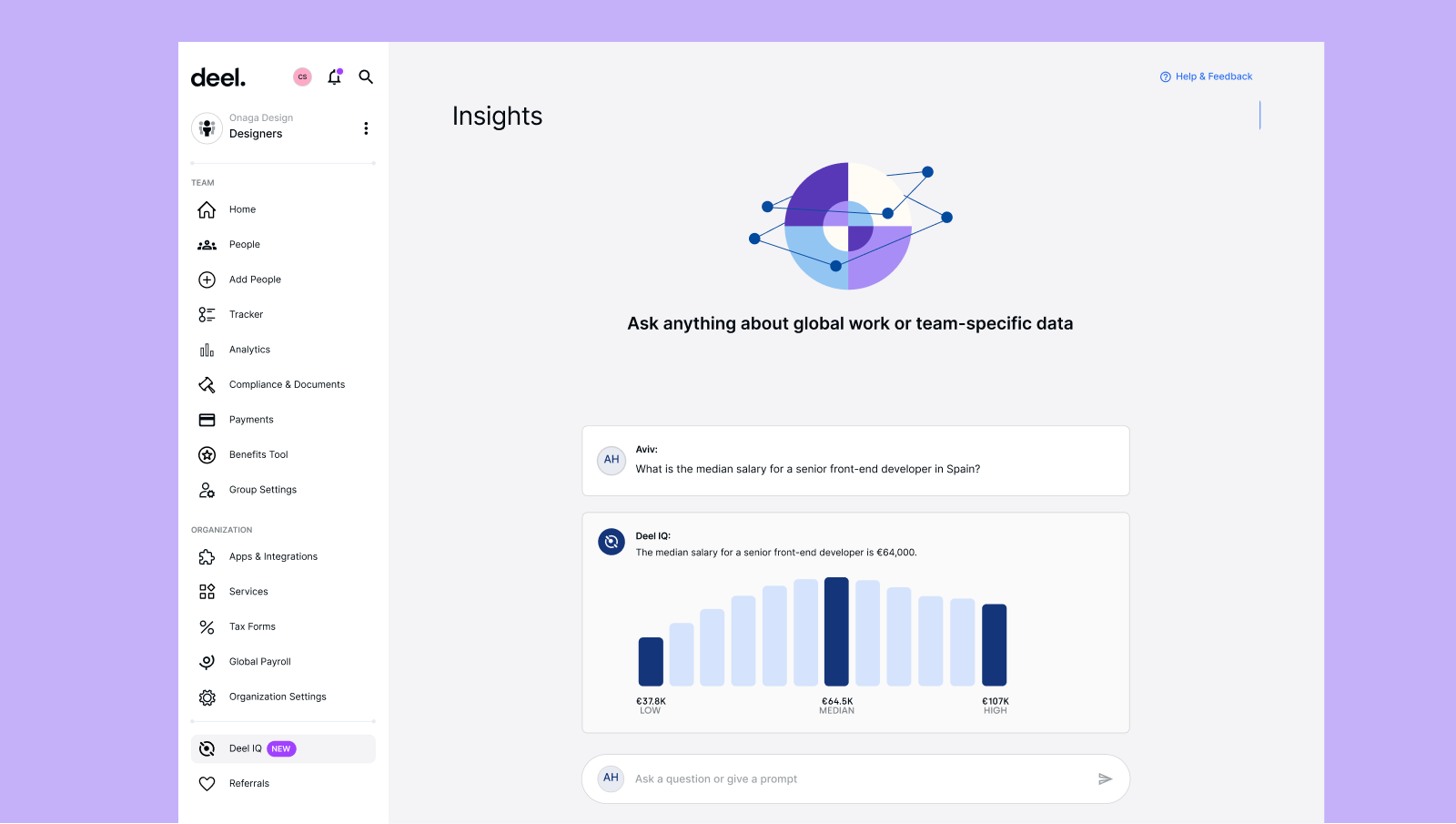


Join our monthly newsletter
The latest insights on today's world of work straight to your inbox.
Sign me up


